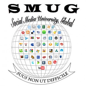
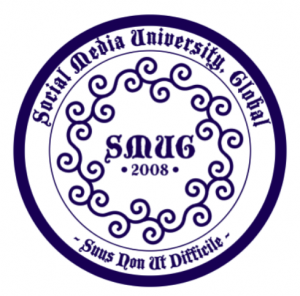
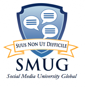
The response to my request for help in developing an official seal for SMUG has been gratifying. We have four excellent submissions to consider as semifinalists, so I’m asking your help in narrowing the field. Here are the entries:


Please vote for your favorites (refer to the entry number) in the poll in the sidebar, and share any thoughts about what you see as the pros and cons of each design in the comments below. If seeing these entries gets your creative juices flowing and makes you want to submit an entry of your own, we would consider those creating another pool of semifinalists and then bringing the top vote-getter from that pool forward against the one judged the strongest from this first pool.
Update: You also can vote through Twitter, using the hashtag #smugseal. Just copy the text below and paste into Twitter, and replace “N” with the number of your preference:
I’m voting for Entry N in the #smugseal contest. http://bit.ly/dbFJQ What do you think?
Voting on the semifinalists runs through the end of July.
HUGE thanks to Amy Kapinus, Ruth LaGue and Reed Smith for their creativity and efforts in submitting these semifinalists. I think they all look really great, and they are such a tremendous improvement over our current word mark.

I like #1 just a tad more than #4. All are pretty cool 🙂
Fantastic work! I like #4.
Great work! I like #2 – although it may be tough reproduce on the official SMUG wearables collection…
My favorite is No. 2, and I hope we can buy sweatshirts!
I like #2. It smiles. When you smile, the whole world smiles with you. 🙂
I like option 2! Can’t wait for that on a coffee mug…
All are fantastic! I’m casting my vote for #2
Logos have to work in a 1 inch format. #1 represents the concept in a clean, professional manner. I would replace 2008 with “SMUG” under the monitor in the center. Or, did you consider adding the hyphens in the name and .org to direct people to the website?
All of them are very cool. #2 is my favorite.
Chancellor Lee: my vote is numero umo; with #2 as 2nd choice!
I like #1 and #4 but my vote is for #4. I think it is more friendly
I love 2, but will have to vote for 4 since it had greater potiental to stand the tests of time as well as look great in black and white.
Casting my vote for #4
I like #2 and #4.
To me, the choice is #1 HANDS DOWN! Sleek, modern and simple, yet highly communicative and professional. Number 2 is overly literal, overly complex and would require herculean effort (especially #2) to reproduce (not to mention licensing agreements!) Number 3 is overly ornate, with its swirls and overly formal font choice (This is not Harvard! And, SMUG’s inception was 2008, not 1808). I do like choice number 4 a lot, the colors are vibrant and the illustration is ,modern. Moreover, the logo definitely has ability to be simplified into logo vs. brand name, but for most purposes, I like to see the full emblem utilized. Therefore #1 is the winner!
I think #2 is WAY too busy and hard to read … not clean enough visually, and won’t reproduce in a small size. #4 made me smile, and it’s simple and easy to “get.”
Lee.. number 4 is clean, simple and memorable and will translate well in other graphic designs including embroidery (sp?)
I like number 2 for many reasons…but it fails the simplicity test (IMHO.)
If #1 were a little friendlier (maybe colors of #4) I would have voted for it because of it’s simplicity and concept.
My vote is for # 4.
I realise I’m an oddball on this one, but I say number 3 with some slightly revised type work. I like the fact that it’s not so literal but it still illustrates circles of communication. It’s very simple and works well in one color (also a basic requirement for a good logo).
A more modern font and a slightly lighter outline would change the look from “renaissance” to hip, though in general, when you think of a “seal” you think of Olde World style, so I think the designer was right-on with the concept.
I would definitely go with SMUG Seal #1 or #4 – both are visually clean, crisp and memorable. In some ways I like #1 better because it is very classic, but if i have to choose I will go with #4 , which I think would also be a great clothing logo.
Love both #1 and #4, it was hard to choose one above the other. No. 4 is classic and caught my attention immediately!
#4 caught my eye immediately as well. Nice work!
Love #4!
#4 is IT!
Logo #4 has my vote. It’s a classic style yet modern.
I think #4 has better color and looks more modern than #1. If #1 had a less drab color scheme than I’d like it.
I definately was drawn to Number 4…it is simple, powerful, modern and well designed…..just what a logo should be!
#2 is great, but too busy. I’m going for #4. It’s clean, simple and free of gobbledygook…and you know how I hate gobbledygook 🙂
#4 because it’ll translate well with different media but I’m thinking #3 would make a lovely tattoo — or chair cushion (in needlepoint, of course).
I like the one I saw in the SMUG Dining Hall today, with a few tweeks!